Connote Redesign
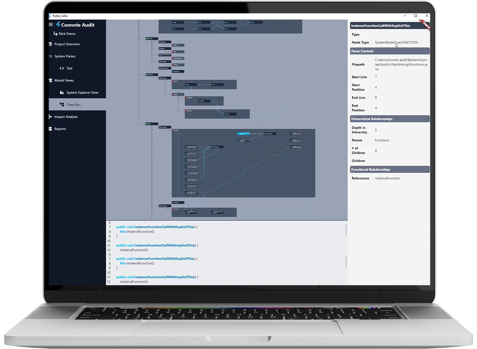
Original Design
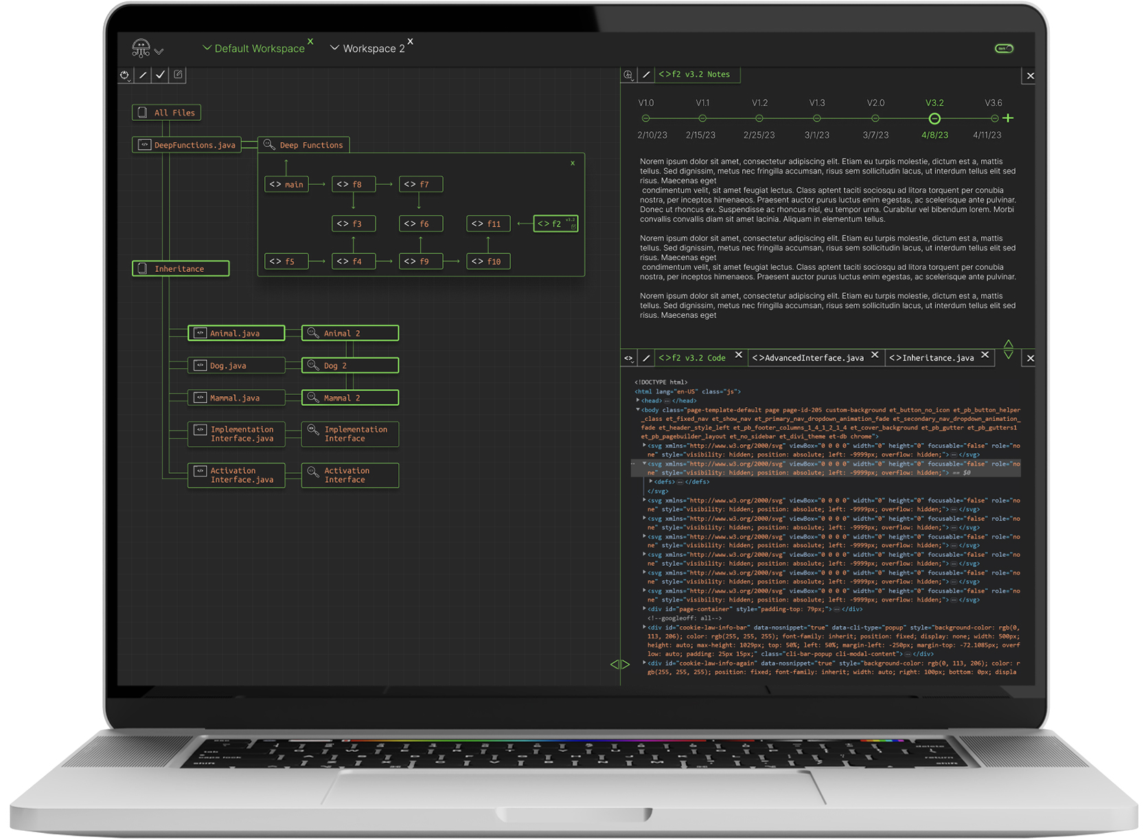
Redesign
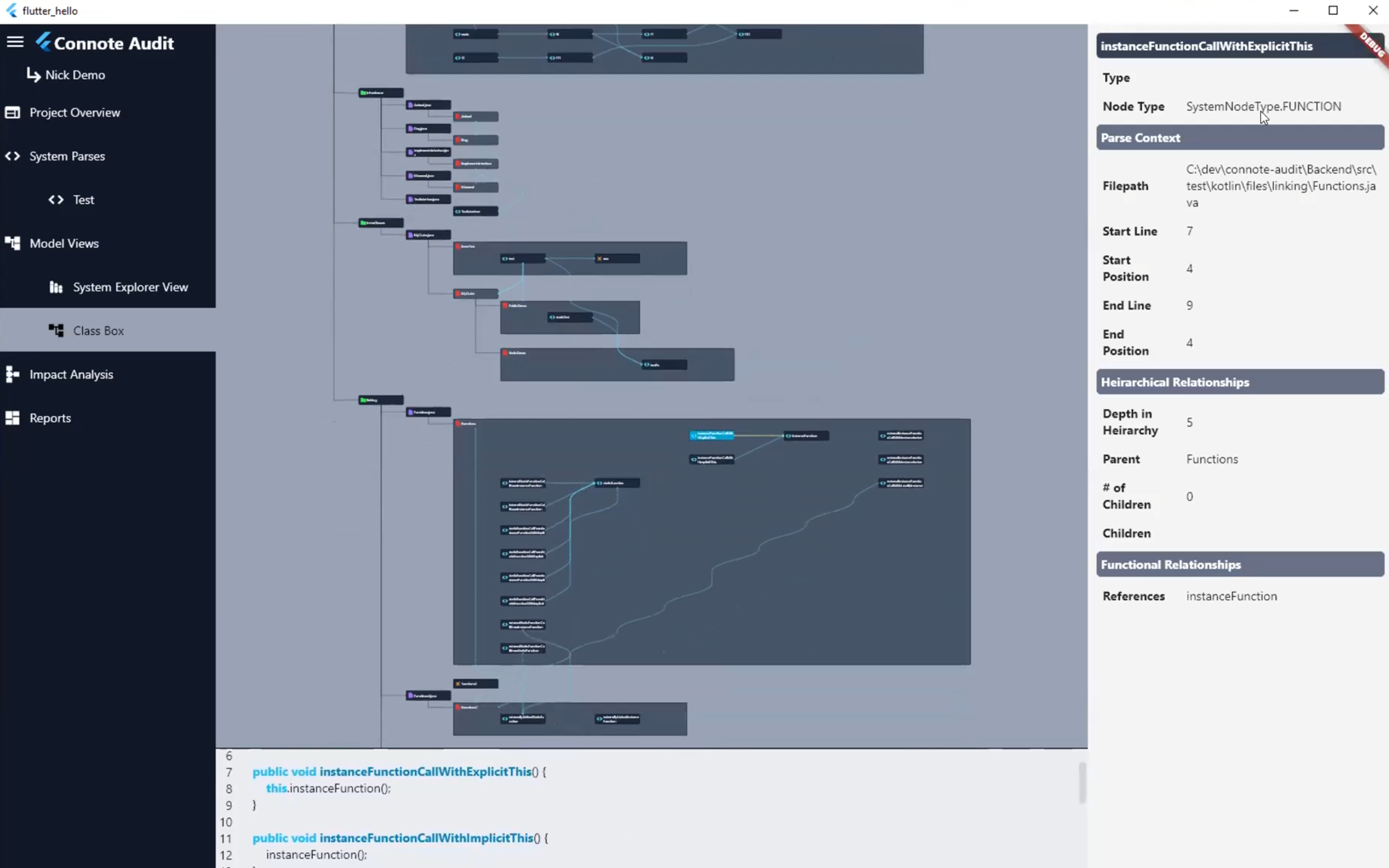
Overview
Connote is a sophisticated enterprise software code tracking and visualization program. Essentially, Connote enables software engineers to highlight a piece of code and see every part of the program that code affects in a visual manner with a code interaction map.
Problem
The biggest problem with the original design was understanding the connections between code sections. The biggest value of the Connote system is seeing which parts of a program will be affected by a code change, and the original design uses a hierarchy visualization structure that is not as clear as it could be. So, the design challenge was primarily to make the connections between code segments more obvious. Additionally, the original design features a largely white or light colored layout, which tends to create eye fatigue. Since this is a program that engineers spend a lot of time looking at, one of the design considerations was to use a new color palette that was a bit darker, with colors that are traditionally found in the backend of code programs (i.e., orange, blue, w
Solution - workspace layout
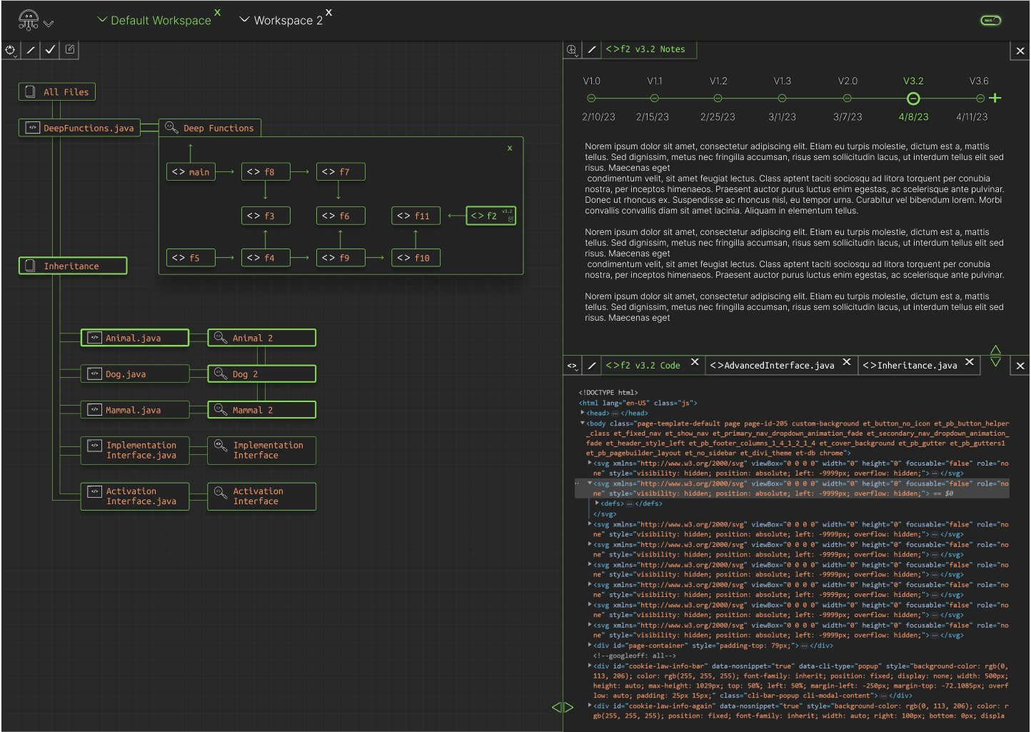
This layout features a multi-window workspace setup. The idea is that the program can be split into multiple windows, and within each of those windows, multiple tabs can be added. Seen here is a 3 workspace layout. The workspace in the bottom right is tabbed with 3 separate tabs, the active tab highlighting in green.

Solution - program focus
Here you can see that <>F2 v3.2 is selected in the Deep Functions box. To make it easy for the user to understand exactly which parts of the program are using the <>F2 v3.2, other sections of the program highlight with a thicker green border when one piece of code is selected. In this example, when F2 v3.2 is selected in the Deep Functions box, the code sections “Inheritance”, “Animal.java”, “Animal 2”, “Dog 2” and “Mammal 2” all highlight with a thicker green border, indicating they are dependent in some way on the F2 v3.2 code segment. Additionally, you can see here that the workspaces on the right update to show F2 v3.2 both in the notes section on the upper right side of this image, as well as in the Code Focus section in the lower right of this image.
Solution - workspace navigation
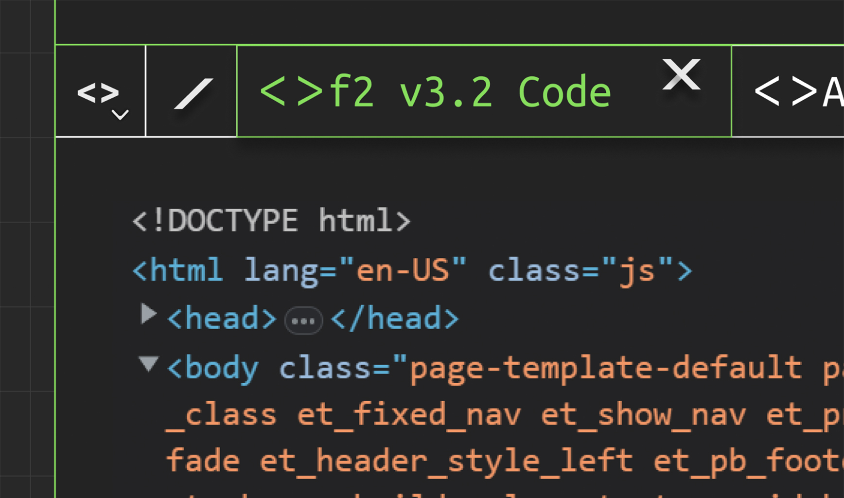
At the top left of this workspace, you can see the workspace navigation icons. The first icon resembling code brackets is the Code Review workspace. The carrot to the right of the icon indicates a dropdown list, which enables users to select a different workspace. The / icon to the right of the workspace icon indicates the ability to split the current workspace into two workspaces.
Solution - workspace resizing
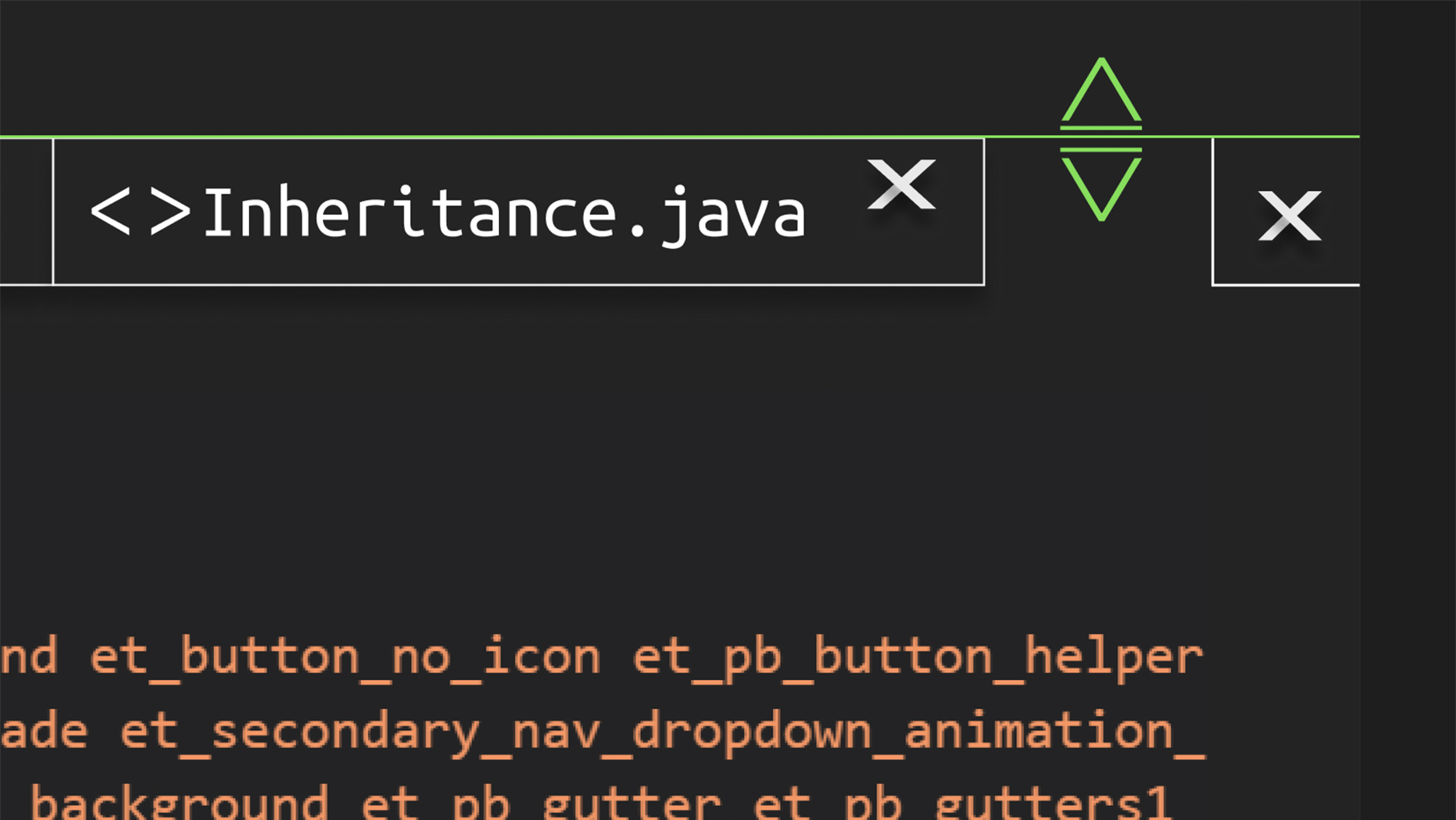
Here you can see the dual arrow icon on the border of the workspace. This is a grab handle to resize the workspaces in the overall program window, allowing for full customization for the user to lay out the program exactly as they see fit.
Solution - color palette
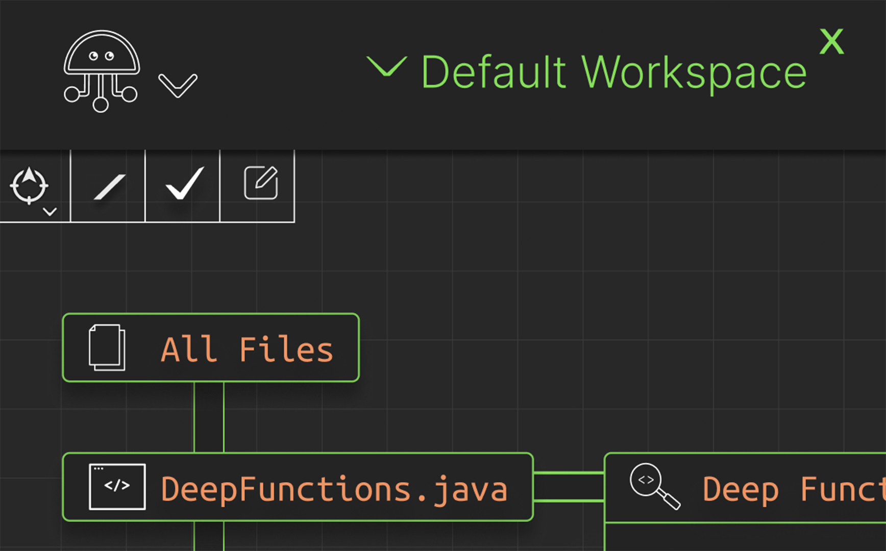
To move away from the overly bright white and light color palette of the original design, I chose a primarily dark gray with neutral color accents palette instead. The orange featured here is a common color for backend coding applications, and the green helps to define spaces and make buttons highly legible. Furthermore, white navigation icons serve to stand out in sharp contrast to the dark background. All of these elements working together create a design that is easy on the eyes, while still being highly legible and visually accessible.
