Watchtower Redesign
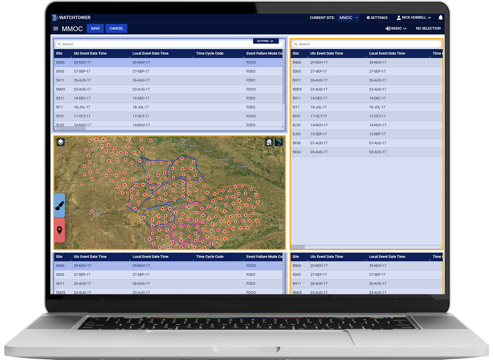
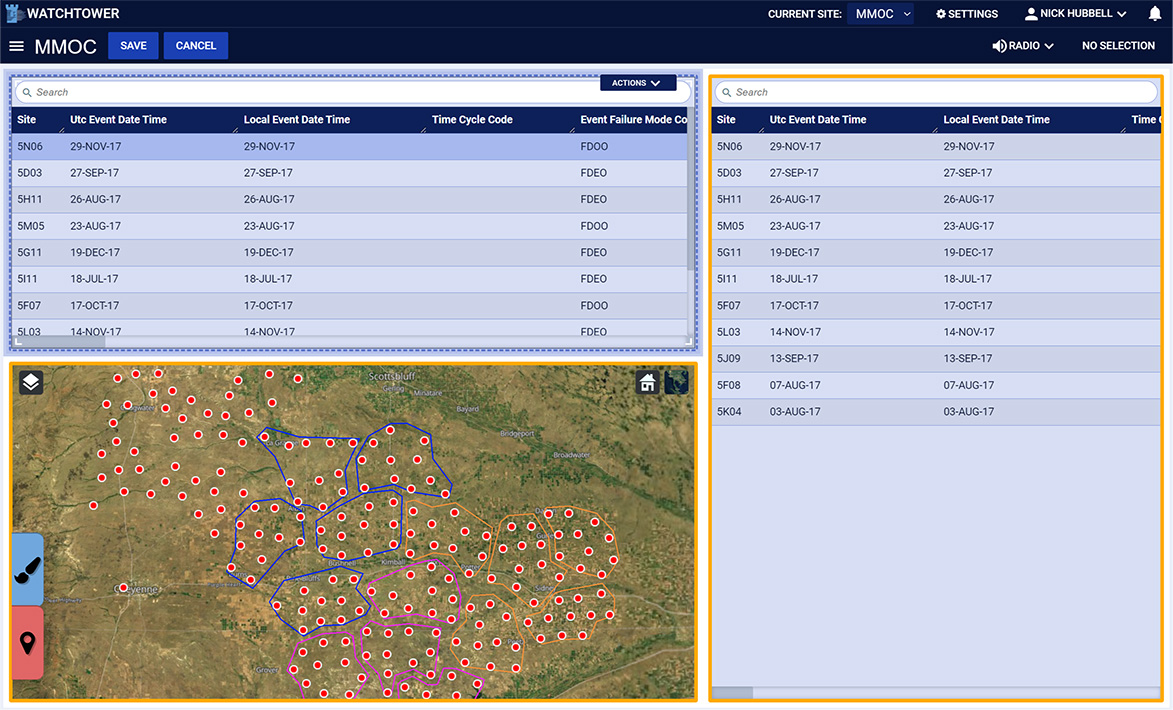
Original Design
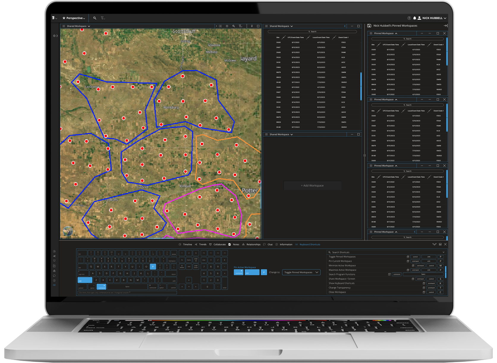
Redesign
Overview
Watchtower is primarily a military asset tracking program designed to keep track of everything from individual tanks to entire convoys and geographic zones. In addition to tracking locations, Watchtower houses information about a myriad of other operationally relevant details, like when vehicles were last serviced or what whether patterns are like on a given operation.
Problem
The original design of this program featured a bright white against dark navy contrast. One of the design challenges was to choose a different color palette that considered extended use case scenarios in which a user would be looking at the program for a long time. Additionally, screen real estate on the original design was not as efficient as it could be, with margins exceeding necessary spacing and menus larger than they needed to be. Legibility was also a primary concern during the redesign. Also, the overall look and feel of the program was not as sleek as the client preferred. Although the original program featured a customizable workspace layout, one of the design objectives was to increase the functionality of that workspace to the user. General usability was another concern with the first design. In other words, the first design lacked sufficient easily accessible data manipulation tools. Another user accessibility problem with the original design was a lack of keyboard shortcuts to perform program actions.
Solution - color palette
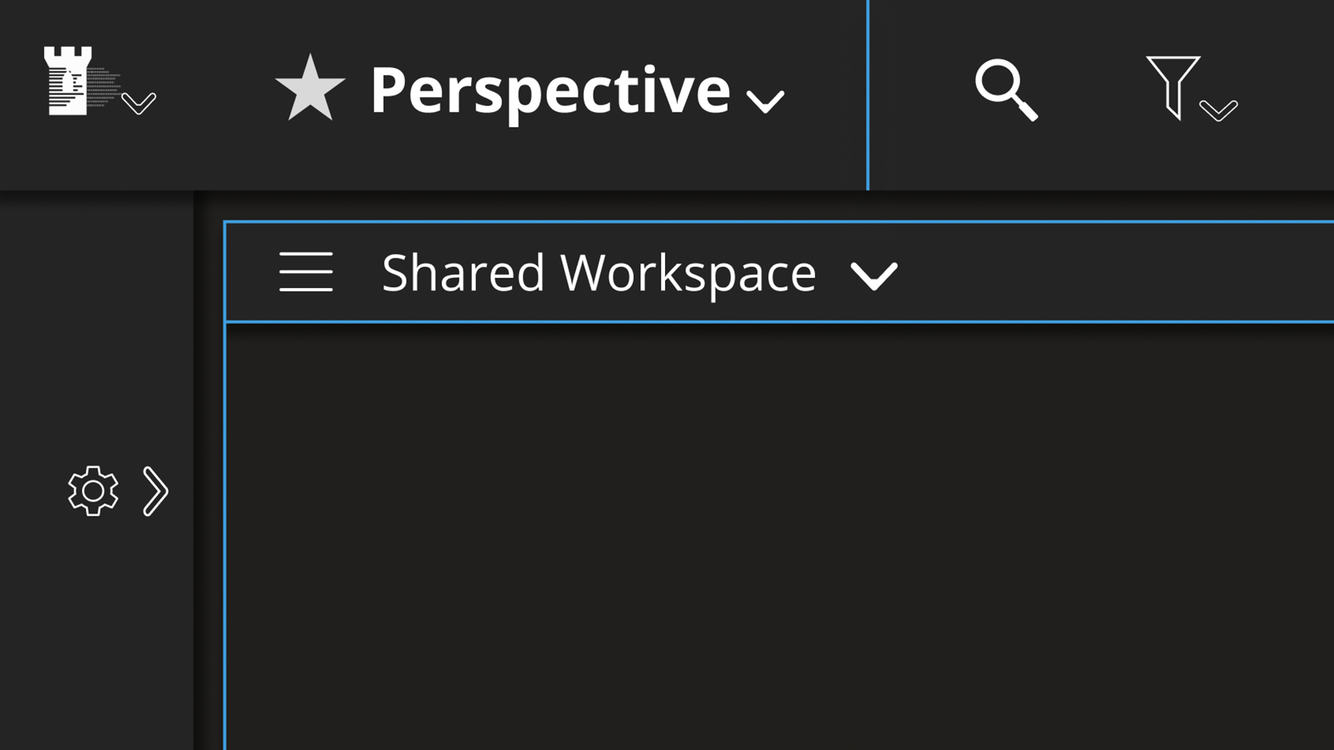
To prevent eye fatigue common with bright white programs, I chose a dark gray, light blue and white color palette. Additionally, screen real estate on the original design was not as efficient as it could be, with margins exceeding necessary spacing and menus larger than they needed to be. Legibility was also a primary concern during the redesign.
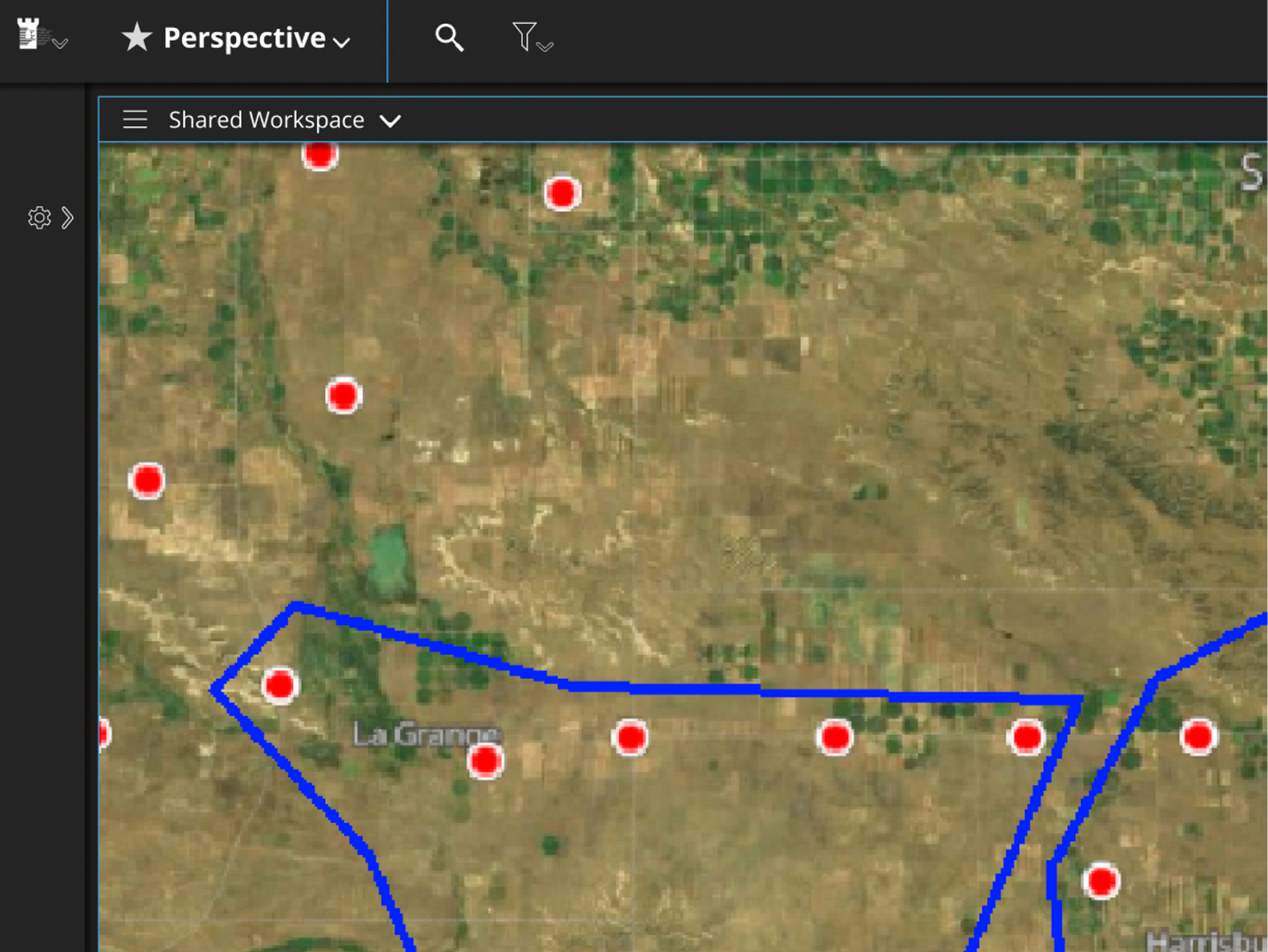
Solution - space efficiency
Since one of the problems with the original design was that the spacing between workspaces was excessive, in the redesign I reduced the margins significantly down to 5 pixels. Enough space to be able to differentiate workspaces from one another but not so much space that it’s distracting. Since overly large menus were an issue with the original design, in this redesign I refined the menus to be much smaller. They are big enough to be easily legible, and small enough to provide extra screen space for other elements of the program.
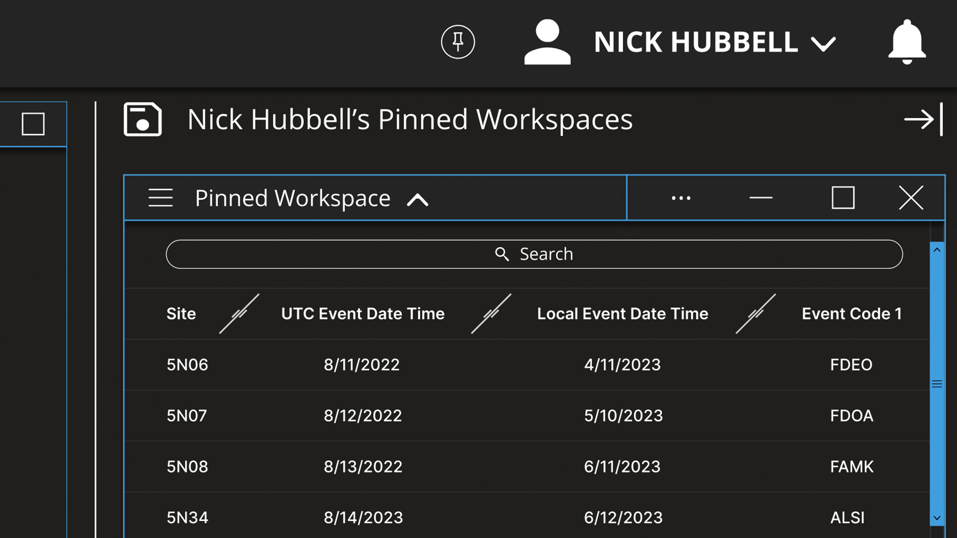
Solution - Legibility
To increase the legibility of the program, I selected the commonly used san-serif font Open Sans for menu items and headers. For data tables requiring small typography, I used the font Inter to increase readability. Both of these fonts feature excellently designed kerning, helping further with legibility. Additionally, I carefully considered the padding around type elements in this design, making sure to leave enough room for things to be readable, but not so much that the design looks clunky. This typographic approach is one of the primary reasons this design ultimately turned out so sleek and streamlined.
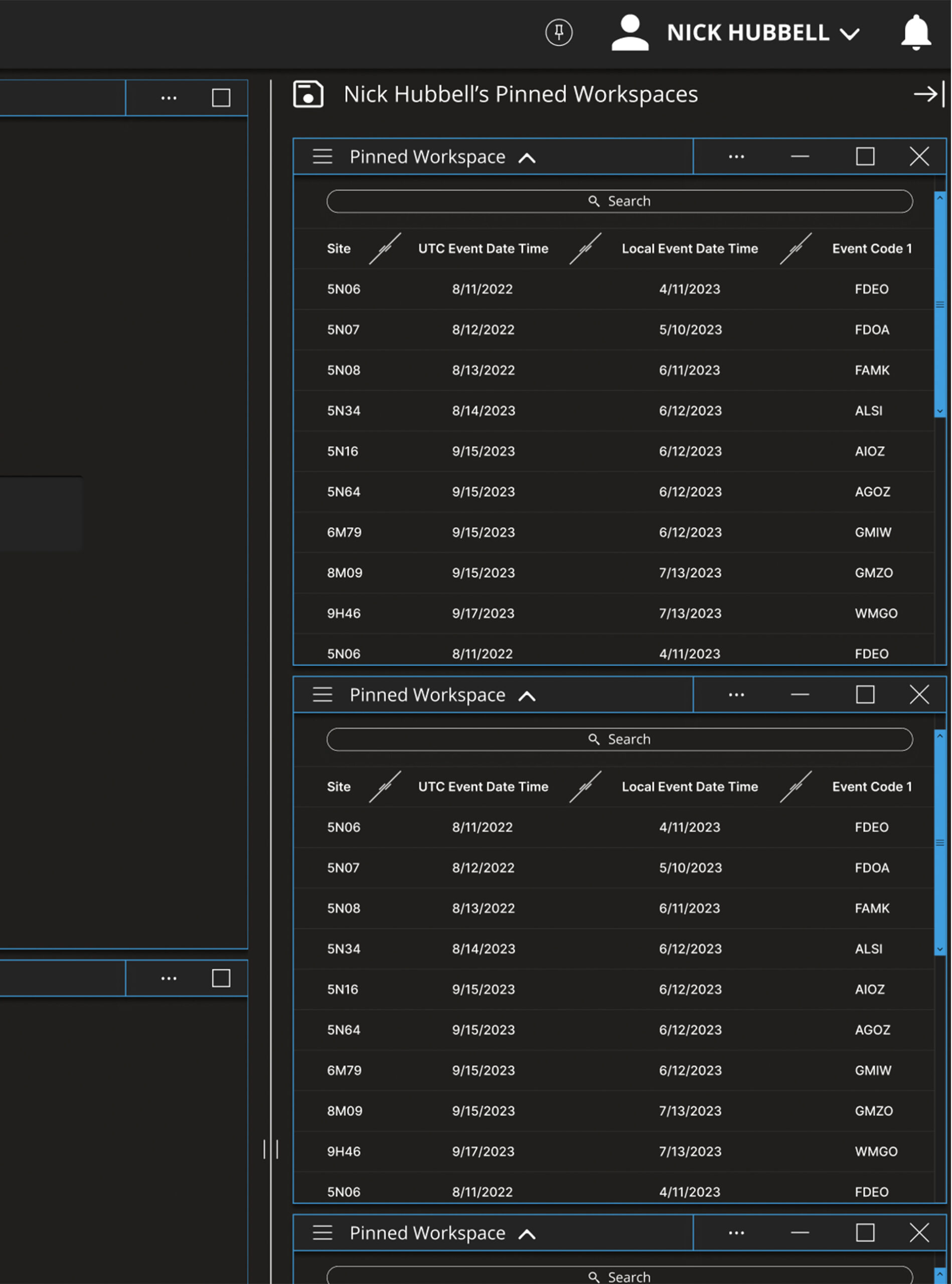
Solution - workspace usability
To add to the usability of the workspaces in this design, I added this section to the right side of the program layout called “pinned spaces”. The idea is that pinned spaces occupy a space of customizable width on the right of the page, and can be saved and loaded for unique users easily. to the left of the pinned spaces, you’ll find a thin vertical white bar with a grab handle in the middle for easily resizing the pinned spaces. This whole approach makes it possible to load two perspectives simultaneously: one saved perspective for the main program space, and one saved perspective for the pinned spaces.
Solution - look and feel
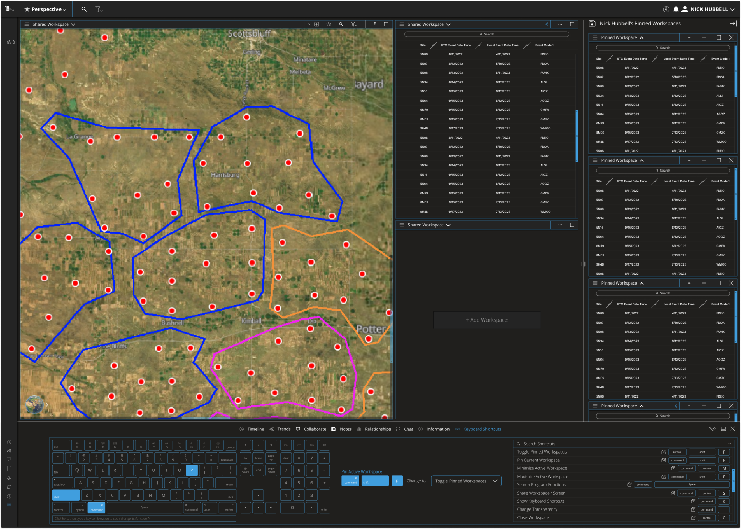
The overall look and feel of the redesign is sleek and streamlined, featuring navigation and legibility improvements. Spacing between elements is tighter than the original design while still being easily legible due to type choices as well as blue borders on each of the elements. Blue scroll bars also help the user to navigate within a given workspace.

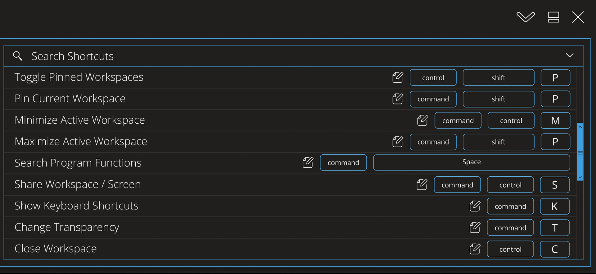
Solution - keyboard shortcuts
To address the lack of a keyboard shortcut tool, I included a design for a keyboard shortcut tool that highlights the current shortcut of any combination of keys being pressed, along with the ability to change the associated program action. In the bottom frame here, you can see the far right side of the tool, which allows users to enter a search term for program actions.
